Excel
Excel ISBLANK Function: Learn with Example
What is ISBLANK function? ISBLANK function used to check whether a cell is empty or not. Since this...
Graphics, images, and charts are great ways to visualize and represent the data, and Excel does exactly same thing for us by automatically creating the charts. There may be times when we would like to go beyond the basic charts that excel creates for us. This tutorial will focus on that complexity.
An advanced chart is a chart that goes beyond the basic charts created by Excel. Let's say you have more than one set of data that you would like to compare on the same chart, you can create your basic chart with one set of data then add more datasets to it and apply other items i.e. formatting to the chart. This is what advanced charts are all about.
In this tutorial exercise, we will assume that we run a blog and have software that gives us the number of monthly visitors. We would like to see the relationship between the numbers of articles published per month vs the total month traffic. We will work with the following data set.

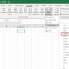
It's now time to take our charts beyond the basics. Select the orange bars representing traffic


Congratulations, you just created a chart with two types of charts in it.
Let's now add a secondary axis to our chart to make it look more presentable.

Let's now edit the chart, primary and secondary axis titles as shown below.

Write Monthly Published Articles vs Site Traffic. Your complete chart should now look as follows

As you can see from the above complete chart, we have consolidated two data sets and visualized them in such a way that it easily shows the effect of one data set onto the other.
Advanced charts are a great way of consolidating more than one data set and visualizing them to identity patterns, etc.
What is ISBLANK function? ISBLANK function used to check whether a cell is empty or not. Since this...
Microsoft Office is a collection of office-related applications that are used to create documents,...
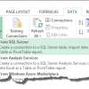
In this tutorial, we are going to import data from a SQL external database. This exercise assumes...
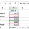
Download PDF Following are the Most Frequently Asked Excel Formulas in an interview 1) SUM...
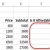
In this tutorial, we are going to cover the following topics. Data validation Data filters Group...
Things will not always be the way we want them to be. The unexpected can happen. For example,...