R Programming

Factor in R: Categorical Variable & Continuous Variables
What is Factor in R? Factor in R is a variable used to categorize and store the data, having a...
Histogram is a type of bar chart that is used to represent statistical information by way of bars to display the frequency distribution of continuous data. It indicates the number of observations that lie in-between the range of values, which is known as class or bin.
A histogram chart helps you to display the distribution of numerical data by rendering vertical bars. You can compare non-discrete values with the help of a histogram chart.
For example, the count of students who got English subject marks on an exam in various ranges that can be visualized using a histogram chart.
Bar Chart is used to compare the frequency, total count, sum, or an average of data in different categories by using horizontal or vertical bars. It is also known as a column chart.
With the help of Bar Chart, you can also do various types of category comparison, which is graphically visualized using a bar chart. Generally, the bar chart will have an axis, label, scales, and bars, represent measurable values like percentages or numbers.
Bar Plots are used to display all types of data, from quarterly sales, seasonal rainfall to job growth. Sometimes you can use a double bar graph to evaluate two data sets. It is also used to evaluate two or three data sets easily.
While constructing a Histogram, you need to take the observations and split them into a logical series of intervals called bins.
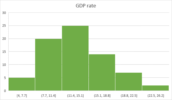
Above given chart showing the GDP rate range in a special year.
Here is a survey of 100 people about their favorite food
| Favorite Food | ||||
| Hot dog | Pizza | Burger | Sandwich | Pasta |
| 10 | 25 | 20 | 35 | 5 |
Bar Graph:
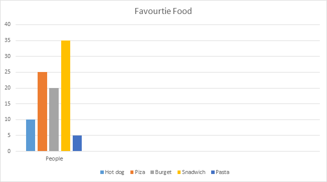
The above-given example shows the most liked food is Sandwich, and the least liked food is pasta in this survey.
| Histogram | Bar Graph |
|---|---|
| The histogram is a term that refers to a graphical representation that shows data by way of bars to display the frequency of numerical data. | The bar graph is a graphical representation of data that uses bars to compare different categories of data. |
| Distribution of non-discrete variables. | Comparison of discrete variables. |
| Bars touch each other, so there are no spaces between bars. | Bars never touch each other, so there are spaces between bars. |
| In this type of graph, elements are grouped so that they are considered as ranges. | In this type of graph, elements are taken as individual entities. |
| Histogram width may vary. | The bar chart is mostly of equal width. |
| To display the frequency of occurrences. | To compare different categories of data. |
| In Histogram, the data points are grouped and rendered based on its bin value. | In the Bar graph, each data point is rendered as a separate bar. |
| The items of the Histogram are numbers, which should be categorized to represent data range. | As opposed to the bar graph, items should be considered as individual entities. |
| In Histogram, we cannot rearrange the blocks. | Bar graph, it is common to rearrange the blocks, from highest to lowest |
Here are the Pros/benefits of histogram:
Here are the Pros/benefits of bar graph:
Here are the cons/drawback of histogram:
Here are the cons/drawback of a bar graph:
What is Factor in R? Factor in R is a variable used to categorize and store the data, having a...
Email client is a software application that enables configuring one or more email addresses to...
Linux is a multi-user system, which allows many users to work on it simultaneously. So what if...
What is System Software? System Software is a set of programs that control and manage the...
What is Logistic regression? Logistic regression is used to predict a class, i.e., a probability. Logistic...
MAC includes a huge collection of the built-in app. However, there are many useful software that...