Excel
Advanced Charts & Graph in Excel
Graphics, images, and charts are great ways to visualize and represent the data, and Excel does...
There will be times when you will be required to analyse large amounts of data and produce easy to read and understand reports. Pivot tables allow us to analyse such data and produce reports that meet our business reporting requirements.
In this tutorial, we are going to cover the following topics;
A Pivot Table is a summary of a large dataset that usually includes the total figures, average, minimum, maximum, etc. let's say you have a sales data for different regions, with a pivot table, you can summarize the data by region and find the average sales per region, the maximum and minimum sale per region, etc. Pivot tables allow us to analyse, summarize and show only relevant data in our reports.
The image below shows the sample sales data collated from North wind access database.

You can download the sample Excel data here.
Download the above Excel Data File
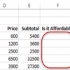
As you can see from the above image, our spreadsheet contains a lot of data. Let's say we want to create a summary of customers, group all of their orders by product, and show the quantities, unit price and subtotals for all the transactions.


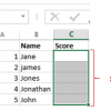
A two-dimensional pivot table is a table that has fields on both rows and columns. Let's say we want to list employee names as rows and use columns to represent customer names and fill in the cells with the total sales.

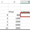
Your pivot table will now look as follows

With Excel 2013, you do not need to create the charts manually. Excel will create the charts for you as you create your pivot tables, change aggregate functions, apply filters, etc.
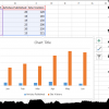
The chart below was automatically created for us from the simple pivot chart exercise that filtered data for Alfreds Futterkiste only.

Pivot tables and charts enable us to summarize and analyse large datasets. We can use aggregate functions such as SUM, MINIMUM, MAXIMUM, AVERAGE, etc. the charts are automatically created and updated for us by excel as we work with the data.
Graphics, images, and charts are great ways to visualize and represent the data, and Excel does...
Things will not always be the way we want them to be. The unexpected can happen. For example,...
Formulas and functions are the building blocks of working with numeric data in Excel. This article...
In this tutorial, we are going to import data from a SQL external database. This exercise assumes...
What is VLOOKUP? Vlookup (V stands for 'Vertical') is an in-built function in excel which allows...
In this tutorial, we are going to cover the following topics. Data validation Data filters Group...