SAP - HR
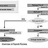
Overview of Payroll Process in SAP
Payroll is a process to calculate the salary and wages of permanent and temporary employees of an...
A bivariate relationship describes a relationship -or correlation- between two variables, and . In this tutorial, we discuss the concept of correlation and show how it can be used to measure the relationship between any two variables.
There are two primary methods to compute the correlation between two variables.
In this tutorial, you will learn
The Pearson correlation method is usually used as a primary check for the relationship between two variables.
The coefficient of correlation, , is a measure of the strength of the linear relationship between two variables and . It is computed as follow:

with
 , i.e. standard deviation of
  , i.e. standard deviation of
 The correlation ranges between -1 and 1.
We can compute the t-test as follow and check the distribution table with a degree of freedom equals to :

A rank correlation sorts the observations by rank and computes the level of similarity between the rank. A rank correlation has the advantage of being robust to outliers and is not linked to the distribution of the data. Note that, a rank correlation is suitable for the ordinal variable.
Spearman's rank correlation, , is always between -1 and 1 with a value close to the extremity indicates strong relationship. It is computed as follow:

with stated the covariances between rank and . The denominator calculates the standard deviations.
In R, we can use the cor() function. It takes three arguments, , and the method.
cor(x, y, method)
Arguments:
An optional argument can be added if the vectors contain missing value: use = "complete.obs"
We will use the BudgetUK dataset. This dataset reports the budget allocation of British households between 1980 and 1982. There are 1519 observations with ten features, among them:
library(dplyr)
PATH <-"https://raw.githubusercontent.com/gtupapers-edu/R-Programming/master/british_household.csv"
data <-read.csv(PATH)
  filter(income < 500)
  mutate(log_income = log(income),
         log_totexp = log(totexp),
         children_fac = factor(children, order = TRUE, labels = c("No", "Yes")))
  select(-c(X,X.1, children, totexp, income))
glimpse(data)
Code Explanation
Output:
## Observations: 1,516## Variables: 10
## $ wfood        <dbl> 0.4272, 0.3739, 0.1941, 0.4438, 0.3331, 0.3752, 0...
## $ wfuel        <dbl> 0.1342, 0.1686, 0.4056, 0.1258, 0.0824, 0.0481, 0...
## $ wcloth       <dbl> 0.0000, 0.0091, 0.0012, 0.0539, 0.0399, 0.1170, 0...
## $ walc         <dbl> 0.0106, 0.0825, 0.0513, 0.0397, 0.1571, 0.0210, 0...
## $ wtrans       <dbl> 0.1458, 0.1215, 0.2063, 0.0652, 0.2403, 0.0955, 0...
## $ wother       <dbl> 0.2822, 0.2444, 0.1415, 0.2716, 0.1473, 0.3431, 0...
## $ age          <int> 25, 39, 47, 33, 31, 24, 46, 25, 30, 41, 48, 24, 2...
## $ log_income   <dbl> 4.867534, 5.010635, 5.438079, 4.605170, 4.605170,...
## $ log_totexp   <dbl> 3.912023, 4.499810, 5.192957, 4.382027, 4.499810,...
## $ children_fac <ord> Yes, Yes, Yes, Yes, No, No, No, No, No, No, Yes, ...
We can compute the correlation coefficient between income and wfood variables with the "pearson" and "spearman" methods.
cor(data$log_income, data$wfood, method = "pearson")
output:
## [1] -0.2466986
cor(data$log_income, data$wfood, method = "spearman")
Output:
## [1] -0.2501252
The bivariate correlation is a good start, but we can get a broader picture with multivariate analysis. A correlation with many variables is pictured inside a correlation matrix. A correlation matrix is a matrix that represents the pair correlation of all the variables.
The cor() function returns a correlation matrix. The only difference with the bivariate correlation is we don't need to specify which variables. By default, R computes the correlation between all the variables.
Note that, a correlation cannot be computed for factor variable. We need to make sure we drop categorical feature before we pass the data frame inside cor().
A correlation matrix is symmetrical which means the values above the diagonal have the same values as the one below. It is more visual to show half of the matrix.
We exclude children_fac because it is a factor level variable. cor does not perform correlation on a categorical variable.
# the last column of data is a factor level. We don't include it in the code
mat_1 <-as.dist(round(cor(data[,1:9]),2))
mat_1
Code Explanation
Output:
##            wfood wfuel wcloth  walc wtrans wother   age log_income
## wfuel       0.11
## wcloth     -0.33 -0.25
## walc       -0.12 -0.13  -0.09
## wtrans     -0.34 -0.16  -0.19 -0.22
## wother     -0.35 -0.14  -0.22 -0.12  -0.29
## age         0.02 -0.05   0.04 -0.14   0.03   0.02
## log_income -0.25 -0.12   0.10  0.04   0.06   0.13  0.23
## log_totexp -0.50 -0.36   0.34  0.12   0.15   0.15  0.21       0.49
The significance level is useful in some situations when we use the pearson or spearman method. The function rcorr() from the library Hmisc computes for us the p-value. We can download the library from conda and copy the code to paste it in the terminal:
conda install -c r r-hmisc
The rcorr() requires a data frame to be stored as a matrix. We can convert our data into a matrix before to compute the correlation matrix with the p-value.
library("Hmisc")
data_rcorr <-as.matrix(data[, 1: 9])

mat_2 <-rcorr(data_rcorr)
# mat_2 <-rcorr(as.matrix(data)) returns the same output
The list object mat_2 contains three elements:
We are interested in the third element, the p-value. It is common to show the correlation matrix with the p-value instead of the coefficient of correlation.
p_value <-round(mat_2[["P"]], 3)
p_value
Code Explanation
Output:
           wfood wfuel wcloth  walc wtrans wother   age log_income log_totexp
wfood         NA 0.000  0.000 0.000  0.000  0.000 0.365      0.000          0
wfuel      0.000    NA  0.000 0.000  0.000  0.000 0.076      0.000          0
wcloth     0.000 0.000     NA 0.001  0.000  0.000 0.160      0.000          0
walc       0.000 0.000  0.001    NA  0.000  0.000 0.000      0.105          0
wtrans     0.000 0.000  0.000 0.000     NA  0.000 0.259      0.020          0
wother     0.000 0.000  0.000 0.000  0.000     NA 0.355      0.000          0
age        0.365 0.076  0.160 0.000  0.259  0.355    NA      0.000          0
log_income 0.000 0.000  0.000 0.105  0.020  0.000 0.000         NA          0
log_totexp 0.000 0.000  0.000 0.000  0.000  0.000 0.000      0.000         NA
A heat map is another way to show a correlation matrix. The GGally library is an extension of ggplot2. Currently, it is not available in the conda library. We can install directly in the console.
install.packages("GGally")
The library includes different functions to show the summary statistics such as the correlation and distribution of all the variables in a matrix.
The ggcorr() function has lots of arguments. We will introduce only the arguments we will use in the tutorial:
The function ggcorr
ggcorr(df, method = c("pairwise", "pearson"),
  nbreaks = NULL, digits = 2, low = "#3B9AB2",
  mid = "#EEEEEE", high = "#F21A00",
  geom = "tile", label = FALSE,
  label_alpha = FALSE)
Arguments:
The most basic plot of the package is a heat map. The legend of the graph shows a gradient color from - 1 to 1, with hot color indicating strong positive correlation and cold color, a negative correlation.
library(GGally)
ggcorr(data)
Code Explanation
Output:

We can add more controls to the graph.
ggcorr(data,
    nbreaks = 6,
    low = "steelblue",
    mid = "white",
    high = "darkred",
    geom = "circle")
Code Explanation
Output:

GGally allows us to add a label inside the windows.
ggcorr(data,
    nbreaks = 6,
    label = TRUE,
    label_size = 3,
    color = "grey50")
Code Explanation
Output:

Finally, we introduce another function from the GGaly library. Ggpair. It produces a graph in a matrix format. We can display three kinds of computation within one graph. The matrix is a dimension, with equals the number of observations. The upper/lower part displays windows and in the diagonal. We can control what information we want to show in each part of the matrix. The formula for ggpair is:
ggpair(df, columns = 1: ncol(df), title = NULL,
    upper = list(continuous = "cor"),
    lower = list(continuous = "smooth"),
    mapping = NULL)
Arguments:
The next graph plots three information:
library(ggplot2)
ggpairs(data, columns = c("log_totexp", "log_income", "age", "wtrans"), title = "Bivariate analysis of revenue expenditure by the British household", upper = list(continuous = wrap("cor",
        size = 3)),
    lower = list(continuous = wrap("smooth",
        alpha = 0.3,
        size = 0.1)),
    mapping = aes(color = children_fac))
Code Explanation
Output:

The graph below is a little bit different. We change the position of the mapping inside the upper argument.
ggpairs(data, columns = c("log_totexp", "log_income", "age", "wtrans"),
    title = "Bivariate analysis of revenue expenditure by the British household",
    upper = list(continuous = wrap("cor",
            size = 3),
        mapping = aes(color = children_fac)),
    lower = list(
        continuous = wrap("smooth",
            alpha = 0.3,
            size = 0.1))
)
Code Explanation
Output:

We can summarize the function in the table below:
library | Objective | method | code |
|---|---|---|---|
Base | bivariate correlation | Pearson | cor(dfx2, method = "pearson") |
Base | bivariate correlation | Spearman | cor(dfx2, method = "spearman") |
Base | Multivariate correlation | pearson | cor(df, method = "pearson") |
Base | Multivariate correlation | Spearman | cor(df, method = "spearman") |
Hmisc | P value | rcorr(as.matrix(data[,1:9]))[["P"]] | |
Ggally | heat map | ggcorr(df) | |
Multivariate plots | cf code below |
Payroll is a process to calculate the salary and wages of permanent and temporary employees of an...
Training Summary Beside supporting normal ETL/data warehouse process that deals with large volume...
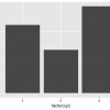
A bar chart is a great way to display categorical variables in the x-axis. This type of graph...
$20.20 $9.99 for today 4.6 (120 ratings) Key Highlights of SAP HANA Tutorial PDF 253+ pages eBook...
What is Continuous Monitoring? Continuous monitoring is a process to detect, report, respond all...
CRM (Customer Relationship Management) stores customer contact information like names, addresses,...