Excel

17 BEST Excel Alternatives in 2021 (Free/Paid)
Excel is a spreadsheet software included in the Microsoft office suite. It widely is used to...
A picture is worth of thousand words; a chart is worth of thousand sets of data. In this tutorial, we are going to learn how we can use graph in Excel to visualize our data.
A chart is a visual representative of data in both columns and rows. Charts are usually used to analyse trends and patterns in data sets. Let's say you have been recording the sales figures in Excel for the past three years. Using charts, you can easily tell which year had the most sales and which year had the least. You can also draw charts to compare set targets against actual achievements.
We will use the following data for this tutorial.
Note: we will be using Excel 2013. If you have a lower version, then some of the more advanced features may not be available to you.
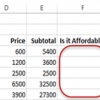
| Item | 2012 | 2013 | 2014 | 2015 |
| Desktop Computers | 20 | 12 | 13 | 12 |
| Laptops | 34 | 45 | 40 | 39 |
| Monitors | 12 | 10 | 17 | 15 |
| Printers | 78 | 13 | 90 | 14 |
Different scenarios require different types of charts. Towards this end, Excel provides a number of chart types that you can work with. The type of chart that you choose depends on the type of data that you want to visualize. To help simplify things for the users, Excel 2013 and above has an option that analyses your data and makes a recommendation of the chart type that you should use.
The following table shows some of the most commonly used charts and when you should consider using them.
| S/N | CHART TYPE | WHEN SHOULD I USE IT? | |
| 1 | Pie Chart | When you want to quantify items and show them as percentages. |
|
| 2 | Bar Chart | When you want to compare values across a few categories. The values run horizontally |
|
| 3 | Column chart | When you want to compare values across a few categories. The values run vertically |
|
| 4 | Line chart | When you want to visualize trends over a period of time i.e. months, days, years, etc. |
|
| 5 | Combo Chart | When you want to highlight different types of information |
|
In this tutorial, we are going to plot a simple column chart that will display the sold quantities against the sales year.

To get the desired chart you have to follow the following steps

You should be able to see the following chart

When you select the chart, the ribbon activates the following tab

Try to apply the different chart styles, and other options presented in your chart.
Download the above Excel Template
Charts are a powerful way of graphically visualizing your data. Excel has many types of charts that you can use depending on your needs.
Conditional formatting is also another power formatting feature of Excel that helps us easily see the data that meets a specified condition
Excel is a spreadsheet software included in the Microsoft office suite. It widely is used to...
Things will not always be the way we want them to be. The unexpected can happen. For example,...
In this tutorial, we are going to cover the following topics. Data validation Data filters Group...
What is Office 365? Office 365 is a suite of programs from Microsoft that run both locally and can be...
Microsoft Office is a collection of office-related applications that are used to create documents,...
Training Summary Excel is the most powerful tool to manage and analyze various types of Data. This...